Gotion, 2024 • Consumer Product
Type
Mobile
Tools
Figma
Role
Sole Product Designer
Status
Launched in 2024

OVERVIEW
An end-to-end plug and charge experience for EV owners to ensure convenience and efficiency through an intuitive user flow.
Led initiative and owned strategy.
Eplus App is an EV-charging mobile application that aims to define the best charging experience for EV owners. The app focuses on optimizing the core charging steps to create an intuitive and smooth charging process.
I led the end-to-end design direction of the app experience for providing EV owners with great charging services and played a pivotal role in defining the whole charging process.

1.1
Solution Overview.
IMAGE
CONTEXT
Address hardware limitations through software.
A clear charging process.
Eplus is a service provider offering fast charging services for electric vehicle owners targeting overseas markets. Users can utilize the Eplus App to find charging stations, start charging, make payments, and view charging details, in conjunction with relevant offline charging hardware products to charge their electric vehicles.

2.1
EV charging process.
IMAGE
A tricky hardware challenge.
The functional support of Eplus charging hardware products will somewhat influence software design decisions and user experience. Currently, a significant hardware limitation affecting user experience is that a single user can only have one ongoing order at a time. This means that users cannot start a new order until the previous charging order is completed. How to intuitively and efficiently prompt users without causing confusion requires careful consideration.

2.2
Hardware limitation.
IMAGE
Design goals.
Without interrupting the user flow, suggest to the user that they cannot start a new order while there are pending orders.
Adjust the position of the charging information capsule to keep it visible for user viewing and interaction.
Business objectives.
Reduce the complexity of user processes and improve the efficiency of user ordering operations, thereby increasing the order rate.
Improve the smoothness of user operations, reduce the cognitive load on users, and increase software usage rates.
PROBLEM
A better feedback mechanism is needed.
Starting from what we already had.
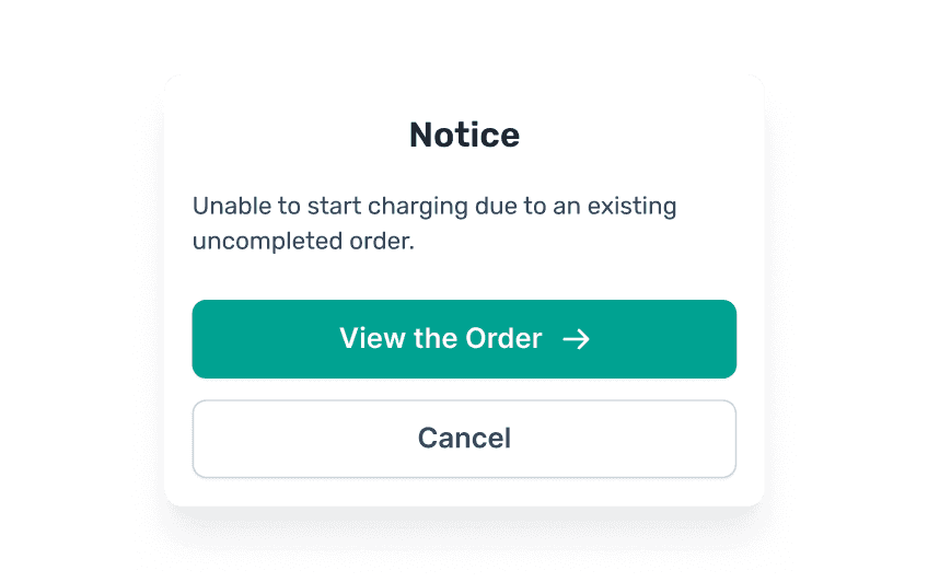
When a user has an ongoing charging session, a long pill will appear at the bottom of the homepage map to inform the user of the ongoing session and to conveniently check real-time charging information. When the user is intent to start a second charging session, a pop-up will remind the user that multiple charging sessions cannot be started simultaneously, guiding the user to view the current unfinished session.

3.1
Old feedback mechanism.
IMAGE
Is pop-up always a good idea?
Under normal circumstances, using pop-ups for text reminders and operational guidance when certain factors limit user actions can be considered a standard solution. However, this standard approach can sometimes lead to other issues, prompting us to seek better interaction models.
For core processes like charging, it is important to minimize the use of interaction methods that can interrupt the user's workflow, such as modal pop-ups, especially at the beginning of a core process like starting a charging session.
When the charging pill is at the bottom, it can be obscured after certain map operations, preventing consistent visibility and interaction for the user. For example, selecting a map station may cause a station card to pop up, covering the entire pill.

3.2
Bad feedback mechanism.
IMAGE
FLOW
Define critical path for minimum complexity.
Analyze current user flow.
The current flow is a common process for charging apps, where users can start charging from the homepage map or the station details. Once successfully initiated, they will enter the details page for charging. If there are ongoing sessions, the charging pill provides a quick entry to the charging details page, and there is also a pop-up feedback with a button to guide users to view it when starting a second charging session.

4.1
Old user flow.
IMAGE
More is less - simplify.
In analyzing the user flow, it can be observed that whether starting charging from the homepage map or station details, the quick entry from the charging pill, or the feedback prompts, all lead to the final destination - the charging details page. Is it possible to have a more concise and intuitive process or model for entering the charging details page for cases with ongoing sessions? For instance, would it be feasible to uniformly use the charging pill as the medium?

4.2
Flow optimization.
IMAGE
RESEARCH
Establish a foundation for design decisions.
Discovering while defining.
As I continue to dive deeper into early design ideas, I have compiled a series of questions that I believe will significantly impact the subsequent design progress, but for which I do not yet have clear answers.
To find answers to these questions, I reviewed previous market research reports and user testing cases, while also seeking guidance and basis for usability evaluation during the subsequent design deepening.
DISCOVERYS
Are there many users who need to start two charging sessions simultaneously? Will there be cases of starting a third or fourth charging session?
Although there are quite a few users who own more than one electric vehicle, typically, owners ensure that at least one vehicle has sufficient charge for normal use, so the situation of charging two vehicles simultaneously is not common, and having more than two is even rarer.
When is the best time to inform users about the limit on the number of charging sessions, after starting the first charging session or before starting the second?
To avoid users discovering they cannot start charging again after parking in the charging area, which could lead to time losses and a loss of trust, it is best to inform users about the charging session limit as early as possible.
How can we prompt users who may potentially start a second charging session without affecting those who do not have this need?
Given that the number of users needing to start a second charging session while there are still active orders is not high, it should not affect the operation process and experience for users who only want to start one session. Changes should be minimal within the current interface framework to maintain a consistent interaction experience.
To what extent do users need to be prompted to understand the conveyed information without feeling disturbed?
While minimizing the impact on normal user processes, the charging session limit notification should be as elegant, unobtrusive, and intuitive as possible, providing only subtle hints to users starting multiple charging sessions, avoiding obvious strong reminders or excessive notifications.
Finding opportunities within constraints.
Guided by these conclusions, I have identified the direction for optimizing the user process. Fortunately, the original hardware limitations have become a breakthrough in design, providing me with an intuitive metaphor for this design approach.
SOLUTION
Making simulating intuitive, effort-less, and scalable.
One place, two functions.
The new design cleverly combines real-time charging status and feedback prompts. When there are charging sessions in progress, it replaces the charging entry with a small charging pill, elegantly suggesting to users that they cannot start an additional session. The charging pill remains fixed and visible, simplifying the user flow while avoiding the poor pop-up feedback experience.
This design achieves a seamless optimization of the charging restriction prompt with minimal disruption to users and minimal changes to the interface framework.

6.1
Solution overview.
IMAGE
Turning limitation into impression.
When there is no charging session in progress, the top right corner shows the normal scan button. When there is a charging session in progress, the original bottom long charging pill is condensed to the scan button position, effectively conveying information while enhancing the map viewing experience, subtly indicating to users that they cannot start another charging session until the current one ends.

6.2
Map comparison.
IMAGE
One improvement, dual benefits.
When users select a station on the map, the station card covers the long charging pill, losing its original information conveying function. By combining it with the scan button in the top right corner, this issue is naturally resolved, and map interactions no longer affect the charging pill.

6.3
Map station card comparison.
IMAGE
Propagate for consistency.
The map page and station details page are the only two entry points for users to start charging via QR code. After merging the charging pill with the scan button on the map page, the scan button in the station details also needs to be adjusted accordingly to ensure consistency in interaction experience and expectations, with slight adjustments made to fit the current page structure.

6.4
Station detail comparison.
IMAGE
IMPACT
Resolving hardware constraints without compromising software experince.
Highly recognized by key stakeholders.
I owned and led design strategy for the EV plug and charge App — playing a critical role in scoping and prototyping a transformative feature set.
The design optimization has received positive feedback from internal and external users after its launch. The feedback experience has been significantly optimized, improving intuitive interaction continuity and reducing friction for understanding a hardware limitation.